
I have a certain stamping style- some colors and layouts are just more COMFORTABLE to me than others- I want to break out of it many times but I find that it just feels not ME- like my chest is all somehow pressured! So I find that some of the stamping challenges I follow MAKE me do just that- break out of my comfort zone-even if I don't want to. I think it is a good thing- as Martha would say- in the long run - to try new things, colors, mediums, and see what happens. sometimes I learn thiings I didn't expect that I might be able to apply to my comfort zone stamping. You never know if you don't try! (like the green eggs and ham)
 I follow MAKE me do just that- break out of my comfort zone-even if I don't want to. I think it is a good thing- as Martha would say- in the long run - to try new things, colors, mediums, and see what happens. sometimes I learn thiings I didn't expect that I might be able to apply to my comfort zone stamping. You never know if you don't try! (like the green eggs and ham)
I used the SCS F4A29 sketch for this card and used the CC288 Blushing Artichoke, Mist for the colors -rather victorian I thought. TLC 290 was lace sponging so I had to give it a try except the only lace I had was from the lace trim which did not translate well into sponging- the open area was too small to give a good impression of lace so I improvised and used the tattered angel glimmer mist stencil that looked lacy and sponged it on artichoke CS and ran the whole thing through PTI's woodgrain plate to add some texture and I loved the added dimension.

I then took a Marina Mist CS and used sticky tape to run the victorian lace ribbon in an accordion fashion. I don't know why my pictures came back sideways but you can see what I mean. Tied a loop and put a SU antique brad through the center and put it through the hole I made in the marina CS using the crop a dile.
I did not have a outline flower I wanted from SU so I used Larkspur from PTI which again has that victorian vintage look. Watercolored it using the lid of the classic ink pads, marina mist and artichoke using a blender pen- it always give more translucent watercolor look than just using a straight marker to color it in. Used spellbinders long ovals to cut it out and layer it using next size for the artichoke CS.
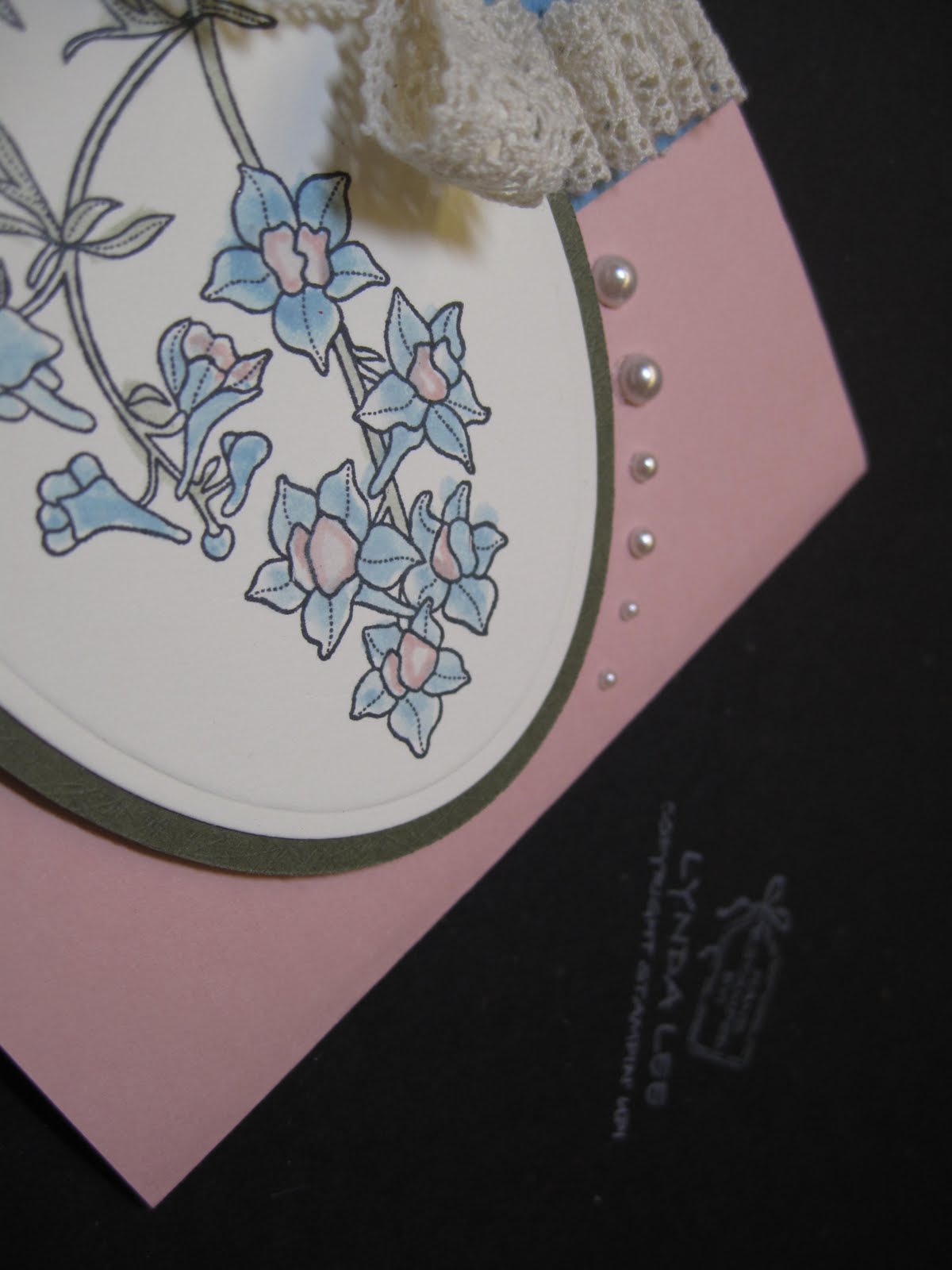
It still did not look finished and I contemplated putting a sentiment around the oval frame on the left but it looked busy. I wanted to reiterate the cream color that I was using so I chose creamy pearl jewels to accent to finish and I thought it looked reasonably finished. Again, victorian, vintage and shabby chic is something I love to look at and admire people for doing it but I know is not my forte but hey I gave it a good college try- I don't think it looks too bad but I will leave it up to you to judge.
Lynda
1 comment:
I like this! I like what you did with the pearls, too .... very nice. And, I know what you mean about not being able to break out of the comfort zone ... I'm just not into the Brights until I'm forced to use them and then they are so pretty all together! I love your owls, by the way. Made me laugh out loud especially at the spooky ones with fangs!
Post a Comment